Monday, 12 December 2011

CARNIVAL


This is a personal project i've been meaning to get round to for awhile. You know that one that just sits n lingers in the back of your mind for ages.... Well here it is!

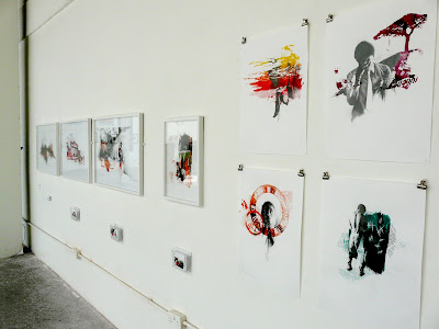
Got the idea from this summers trip to the infamous Nottinghill Carnival (yes, its been lingering for that long haha). Wanted to do something very strong, busy and vibrant, like carnival itself. Still playing with screenprint and pencil combination, this piece is A2, and will hopefully be exhibited in my next exhibition with PJ (www.paperjukebox.com).

Sunday, 20 November 2011

Volume Magazine


This is a piece i did specifically for an article for Volume Magazine.
My collective, the mighty 'Paper Jukebox', are being featured on their blog, talking a little bit about us and showcasing some of our new work!
So check it out at Volume Magazine

Friday, 11 November 2011

Me playing


Well i had an afternoon to kill, so decided to have a little play.
Im still trying out variations of Pencil and Digital Collage, haven't really worked out if i like it yet, but yeh, TA DA!

Wednesday, 9 November 2011

TWOFOLD Magazine "Hollywood The Girl"


This piece i did for issue 2 of TWOFOLD Magazine.

"TWOFOLD is created out of love and passion for everything illustration and typography." ...this im on board with.

Entitled "Hollywood The Girl", i decided to go 'old school Brooks' on this one, and refrained from crowbarring in my current obsession with screenprint, and created the whole image with just my trusty 3B and 3H pencils, with a mild sprinkle of digital collage. And i bloody loved it haha.

So to buy your copy at TWOFOLDMAGAZINE.COM

Tuesday, 1 November 2011

Rioting Romance


This piece was for a Bug I know.

I was asked to interpret a Richard Lam photograph, taken in the middle of the Vancouver riots after the Canucks lost to the Boston Bruins in the Stanley Cup.

It was quite hard to translate, but still fun as its such an amazing photograph! I’m not sure I did it justice tbh, but it was worth a try.

Old 'Riot Dining' Logo


Just found this in the depths of my mac, it was used to promote a 3 day event held in Shorditch by Cremini Suppers. It involved a black tie catered meal, except with food fights and live artists doing...odd stuff everywhere.

Monday, 3 October 2011

POPSHOT magazine. "Making Tracks"


One of my most recent works can be seen in recently released Issue 6 (The Love Issue) of POPSHOT MAGAZINE (www.popshotpopshot.com)

I got a call awhile ago asking if i wanted to take part in the magazine, and jumped at the chance! Literally attacked it. Im was already a big fan of the magazine, so being asked to take part was a real honor.

I was then given a poem to illustrate, entitled 'Making Tracks' by Sean Chard. It was great to work from, as it created some subtle, yet powerful visuals, which i felt translated well through my own work. I also had a lot of freedom, which every illustrator loves!

So if you haven’t already, check it out and subscribe at www.popshotpopshot.com/magazine.html


Making Tracks

Tired, like countless times in the past,

With nothing left but unpleasant silence

in orbit around us - bored and

loitering for months.

We wait on abandoned platforms,

blistering and staring at clumps of dead grass.


No train but the tracks click all the same;

unsteady heat rises from iron lines.

Dust is captured in sunlight’s fever -

disturbed by the ground’s inflamed surface.

Paint peels from the waiting-room door

and inside a stale horde of ghosts reverberate.


We stand at the white lined edge of the platform

And like sleepers in-between the hard grey rocks,

we are the same but different – bolted to the ground.

The breeze moves an empty cardboard coffee cup

to rest up against the tracks and like a stuck record

it taps, jumps and replays the tap – a fitting motif.


We have waited here so many times before;

invisible trains rattled past us, their gusts pushed us back.

Too afraid to cross the line and unable to see

our new destinations, we stood for nothing.

But today we are where we need to be,

We are done and we are undone. End of the line.

Thursday, 22 September 2011

Cobham Cobras


My new basketball team needed a logo designing on the quick, so this is what i came up with... Pretty pleased with it, it looks so angry!!

Saturday, 13 August 2011

New Forest Film Festival (Part 11)


Finished Posters


Logo 5 - Festival summery image


Logo 4 - For the screening of 'Shock Treatment', Richard O'Brien's sequel to 'The Rocky Horror Show'.


Logo 3 - This is an event screening a russian silent film entitled 'The Ghost That Never Returns'; accompanied by live musician's, the audience must take turns powering the projector via use of a cycle-powered generator in order to watch the film. If I'm honest i was sold at 'Russian silent film', its got to be something i've never seen before at the very least!


Logo 2 - Mary Poppins


Logo 1 - Vehicle of Horrors!


So heres what i ended up producing once the brief had been finalized. Very different from what i'd usually do, which was challenging at times, but the finished work translated very well to the website www.newforestfilmfestival.com and posters which was the overall goal, so I'm very happy with it!

Now go and book your tickets!!!!

New Forest Film Festival (Part 1)


This piece was intended as an A3 poster that folds up into a leaflet. I never got the opportunity to see it in 3D form, but i can only imagine it going well (or as well as the A4 version i printed out myself went anyway).


Poster 3 - This image was for a screening of Mary Poppins, with interactive chalk drawing games for the kids and family etc...


Poster 2 - Event entitled the vehicle of horrors! DUN DUN DAAAA. Basically a small group are lead out into the new forest to a secret location, and put in an old scary bus, which had been converted into a cinema, and get the living piss scared out of them by a horror film accompanied by actors. Wont lie, I'm definitely giving this a go!


Poster 1 - New forest themed image... SIMPLES


About a month ago i got asked to do some design work for the New Forest Film Festival. Which upon undertaking turned into nearly a full time job for several weeks (which i suppose is the illustrators dream).

Due to a few miscommunications, i actually ended up doing an early (and basically wrong) brief that was sent to me first. But as I'd finished all the images i thought i might as well post them up here, saves them going to complete waste! So here they are, i'll post up the final ones soon!

Check out the festival at www.newforestfilmfestival.com and come along, it's going to be awesome!

Tuesday, 19 July 2011

Broken Marionettes


Another Album cover, this time for a very talented upcoming duo. Broken Marionettes new EP 'Untruth', check out the link below and have a listen!

Monday, 18 July 2011

'Lose Your Mind' by Joe Reeves


Just done some artwork for a good friends album cover, click the link below and have a listen, you wont regret it!!!


Saturday, 16 July 2011

BRINK


Last week (7th-11th) i took part in Brink!

'A collaborative exhibition of Fine Art, Illustration and Architecture graduates from the Arts University College at Bournemouth. Traditional design bends and dances with the innovative and unexpected in this unique show.'

Taking place in the Old Truman Brewery on Brick Lane, we curated the massive space provided with the fruits of our 3 year degree, climaxing with a brilliant opening night (there was a lot of free alcohol) showcasing our work to a huge audience of both creatives and loved ones.

Following the success of the show, i've now realized that was it... My last grasp of university life, over. And have now basically been spin kicked out into the big wide world...

S**T

Old Street Poster


After being accepted into the Art Below scheme, i was given the opportunity to put up a piece of work on the platform of Old Street underground station! Given its prime location, i hope it will lead to more work, or at the very least dramatically up the hits on my website.

Bournemouth Degree Show


23rd-30th june, at AUCB in Bournemouth, the of the culmination of my degree began with my end of year show! Located within the illustration studio (well, a very well cleaned and prepped version of the illustration studio), we each exhibited a sample of our best work. We got a really good response and a really good opening night; the perfect warm up for my London show.

Monday, 4 July 2011

Final postcards


These are a few of the promotional postcards i've had made up for my BRINK exhibition in a few days time; bit more fun than a business card, bit less fun than seeing the pieces themselves... So come check out the originals 7th -11th July, at Freerange on Brick Lane!

Thursday, 30 June 2011

St Charles Bridge


The idea for this piece came from photos of my travels a few years ago, which were taken in the city of prague; which among many other massive attributes, is an architectural masterpiece! in some areas anyway, such as here, St Charles Bridge... This piece is A1, pencil on screenprint, and currently being framed ready to be exhibited in my London show next week. So if you want to come see it, check out 'Brink', 7th-11th July, at freerange on Brick Lane.

Wednesday, 1 June 2011

Brandenburg Tor


This is a piece of personal work, inspired by my last trip to Berlin, and one of the single most interesting encounters i think i've ever had.
While in a bar, me and a few others were approached by what at first appeared to be a homeless guy (which he probably was to be honest), but turned out to be a nothing short of a philosophical genius. He spoke in a very confused and erratic combination of english and german, but still clearly, and had theories on everything. A few quotes in particular have stayed with me...

"Im an individual soul, I'm only a person when i look in the mirror..."

"The world should be governed by the perfection of productivity..."

I know... utter gold (from an artists perspective anyway, to the average joe he's probably just a f*****g nutter, but still, i liked him). Anyway, he also asked if we wanted to buy songs off him, custom made, that would "enrich our lives every time we read them"; i without pause took him up on his offer. So read on, and i hope your life is enriched because of it...

"More!
In the wicked-circumstances, of eternal damnation, we brought the you. On one ticket! Behind the scenes, of war!, there are playing superlinges. Their laugh or the smile comment the last-hook! Yes!, they can fly!

Tuesday, 10 May 2011

How to get googled...


Business cards!!!! Hopefully be handing you one soon.

Postcards


Playing with handout ideas for my end of year show...

Monday, 9 May 2011

Burning house


This is my last image from 'To Kill A Mockingbird', and the conclusive piece of my EMP project. Depicting a scene from the book where the neighbours house burns down while the children watch... i thought it would be quite a strong visual to recreate, hinting at both their characters, and their roles in the book. A1, pencil on screenprint.

Sunday, 8 May 2011

Robinson Series Concertina


Final presentation, in addition to the originals...